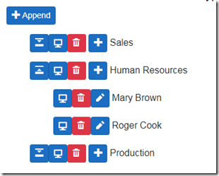
Start with all comforts, save 70% of your development time: a few declarations are enough to generate the markup you need and the whole server interaction code: forget about input fields, the right input filed is generated automatically based on the property type and ViewModel attributes! Changes tracking, to compute changes for the server, query tools to query local and remote data (also server side query tools to power-up your API controllers are included) , advanced components that include grids, detail lists and trees. Basically all components can be Drag and Drop enabled, you don’t need to handle the Drag and Drop process, because you drag automatically the data that are bound to your markup!
Don’t worry about how to prevent the application you send to the client browser from being copied by hackers: you may rely on a double protection:
- Your code is protected by the best protector available on the market: Reactor, that is bundled with Blazor Controls Toolkit.
- Once Blazor Controls Toolkit is included as a dependency the whole application works properly only if it is validated by your server side Asp.net Core application with a complex cryptographic challenge. As a consequence your application is enabled to run properly only when it is connected with your web server!
Below more details about Blazor Controls Toolkit features, but you can try also all of them live:
- The equivalent of all Bootstrap JavaScript components.
- A complete set of input controls that includes all Html5 inputs or their fallback when they are not supported by user browser, dropdowns and autocompletes.
- Validation attributes , and other metadata attributes that enable the developer to define how to render and edit data in a purely declarative way! You just put a generic edit or display component in your markup and the Blazor Controls Toolkit generate automatically for you the markup that implements the behavior declared with your model attributes: space to reserve for each field, the right Html5 input and / or auto-complete to use, and so on.
- Default validation messages, and default button text/labels are already localized in various languages, and the develpèer can customize all of them. Moreover, each customer can require the localization kit to insert his language in the Blazor Controls Toolkit, in case it is not supported, yet. This demo application shows all localized default messages, and labels. However, with the only exception of this introduction page all other application-specific contents are not localized.
- Changes tracking, tracking of invalid objects, and model transactions. All handled with uniform interfaces throghout all components. They prevent futher processing on invalid objects, enable the user to revert changes, and computes all changes to send to the server (additions, deletes and modifications).
- Utility components, like modals, Tabs, pagers, and navigation tools
- All components and html fragments can be drag-drop enabled, and bound to models. As a result of the drop operation list elements or grid rows are moved to different positions or modify the model bound to the drop target.
- Behaviors that enrich existing Html element and other components with further features like collapsing, fading, input focus, visibility spy, anchor target spy.
- Complex customizable components like DataGrids,TreeViews, Detail views, and Detail lists. Each component has its default row and column template that the developer can replace with custom ones.
- Query tools for filtering, sorting, and aggregating data.These tools include components that enable the user to select the desired operations, attributes to declare how to build each filter view, and OData tools to translate the desired operations in OData format, to retrieve data from OData enabled servers, and to OData-enable your Asp.net controllers.
- All components are accessible, and can be operated easily with just the keyboard. After each operation, the focus is moved where more appropriate for continuing keyboard processing. If possible accessibility is enforced also on developer provided custom templates
Tags: Asp.net core, Blazor, Blazor Controls Toolkit