Data Moving Plugin Forms: Detail Views, Data Filtering UI, and Undo/Redo Stack
Data Moving Forms provide standard detail, edit and filter views, but they can be customized with any Html. Moreover, all actions performed in edit mode can be undone and re-done with the typical editors undo/ redo buttons. The developer can either provide a custom column template or the whole edit, detail or filter templates. Forms may work either stand-alone or attached to the items of a grid, TreeView or of any other control. They provide filtering, editing and detail capabilities to a single model or to a collection of items. You may see Data Moving Plugin Forms working in the following video associated to this tutorial:
When Forms are attached to another control they import all settings (columns definitions, detail, edit detail templates, etc.) from a row definition of that control through the DetailFilterBuilder method of the fluent row definition interface:
- .........
- .DetailFilterBuilder(out detailBuilder, modelName: "GridExample.EditDetail.ViewModel", undoredo: "GridExample.EditDetail.undoRedo")
- .........
In this case we passed also the name of the overall page client ViewModel properties where to store respectively the Form client ViewModel and the undo/redo object, because we decided to create a form with client side capabilities.
The detailBuilder object already contains all information that are needed to render all input fields because they were imported from the row definition object that invoked the DetailFilterBuilder method. However we may continue customizing our form by adding toolbars, buttons, Titles, etc:
- @{
- detailBuilder.DeclareViews(true, true, true)
- .OnClose("GridExample.unselectItem")
- .EncloseInValidationForm()
- .StartToolbar(ShowToolbarIn.All).RowContainerLevel(ItemContainerLevel.Row)
- .StartTextColumn("Human Resource Detail", "Edit Human Resource", "Filter Human Resources ").NoWrap(true).EndColumn()
- .AddButtonToolbar(ShowButtonIn.Filter, CommandButtonType.Filter)
- .AppendButton(ShowButtonIn.Display, CommandButtonType.GoEdit)
- .AppendButton(ShowButtonIn.Edit, CommandButtonType.GoDisplay)
- .AppendButton(ShowButtonIn.Edit, CommandButtonType.Save, "validate close")
- .AppendButton(ShowButtonIn.Edit, CommandButtonType.Undo)
- .AppendButton(ShowButtonIn.Edit, CommandButtonType.Redo)
- .EndButtons()
- .EndToolBar()
- .DeclareDialog(new MVCControlsToolkit.Controls.DataGrid.Dialog { CloseOnEscape = true, Draggable = true, Resizable = true, MinWidth = 320, Width = 320, Title = "Human Resources" });
- }
The three true in the DeclareViews method declare that we need both Filter, Edit and Detail views. The OnClose method specifies a javascript action to perform when the dialog is closed; in our case the javascript function removes a Css class from the item the form was attached to in order to edit or to show the item details. EncloseInValidationForm encloses the edit view into an html form and enables client side validation on all form fields.
Then we define a toolbar that contains a text column with a short description of each view (detail, edit,and filter), and several buttons. The first parameter of each button definition specifies which view the button will appear in, while the second parameter specifies the action to be performed by the button. The definition of the save button has a third argument containing two parameters to be passed to the save action: validate and close. This way when the user saves its changes the form is validated and the dialog window that contains the form is closed.
Finally, the DeclareDialog method requires to enclose the form within a Dialog window.
Once we have finished the form definition we can render it with:
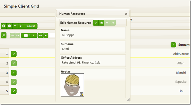
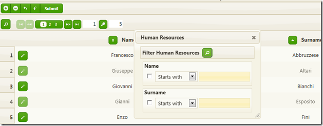
The resulting Edit and Filter views are:

and

As you can see the edit view contains 3 string fields and an image field. The undo-redo buttons work like the undo and redo buttons of a standard text editor: they allow to undo and redo all changes done to the input fields. All four column definitions have been imported from the grid row definition, with no need to specify any custom template. The filter view, instead, contains just two columns: Name and Surname, because these are the only columns that required the filtering (and sorting) services through the Queries method:
- .StartColumn(t => t.Name, width: 46, widthIsPercentage: true).Queries(true, true).HorizontalAlign(MVCControlsToolkit.Controls.Core.HAlign.center).EndColumn()
- .StartColumn(t => t.Surname, width: 46, widthIsPercentage: true).Queries(true, true).HorizontalAlign(MVCControlsToolkit.Controls.Core.HAlign.center).EndColumn()
A form can be defined also as a stand-alone control, without importing the row definition from another control. Also in this case the form can be attached to one or more other controls by exploiting a feature called dynamicEdit that is able to handle concurrent access to the same form from different controls. The form containing just a tinyMce editor in the E-Mail examples of the Data Interactions and Dragging video uses dynamicEdit to work as a text editor for various fields of various controls in the page.
Below the definition of a stand-alone form with some custom column definition:
- var h = Html.SendToClient(m => m, "FormExample.ClientViewModel", undoRedo: "FormExample.formUndoRedo");
- h.DeclareStringArray(new string[] { "no", "yes" }, "standardBoolean", true);
- var formR = h.FormFor(m => m)
- .TopHtmlAttributes(new { @class = JQueryUICssClasses.ContentContainer })
- .OnOperationExecuting("customCommands")
- .StartToolbar()
- .RowContainerLevel(ItemContainerLevel.Row)
- .AddButtonToolbar(ShowButtonIn.Edit, CommandButtonType.GoDisplay)
- .AppendButton(ShowButtonIn.Display, CommandButtonType.GoEdit)
- .AppendButton(ShowButtonIn.Edit, CommandButtonType.Reset)
- .AppendButton(ShowButtonIn.Edit, CommandButtonType.UndoAllSteps)
- .AppendButton(ShowButtonIn.Edit, CommandButtonType.Undo)
- .AppendButton(ShowButtonIn.Edit, CommandButtonType.Redo)
- .AppendButton(ShowButtonIn.Edit, CommandButtonType.RedoAllsteps)
- .AppendButton(ShowButtonIn.Both, CommandButtonType.Custom, "operation-submit").Texts("Submit")
- .EndButtons().EndToolBar()
- .AddRowType()
- .AddColumn(m => m.Title)
- .AddColumn(m => m.Description)
- .StartColumn(m => m.Date).CustomTemplateFixed(TemplateType.DetailEdit,
- @<text>
- @item.TypedTextBoxFor(m => m.Date,
- new {data_role_default=DateTime.Today.ToString()},
- GenericCssClasses.Watermark,
- ContentAlign.Left,
- calendarOptions: new CalendarOptions())
- </text>)
- .EndColumn()
- .StartColumn(m => m)
- .CustomTemplateFixed(TemplateType.DetailEdit,
- @<div class='ui-widget-content custom-column'>
- <h4>@item.LabelFor(m => m.EnableComments)</h4>
- @item.CheckBoxFor(m => m.EnableComments)
-
- <h4>@item.LabelFor(m => m.Publish)</h4>
- @item.CheckBoxFor(m => m.Publish)
- </div>)
- .EditDetailColumnCompletelyCustom()
- .CustomTemplateFixed(TemplateType.DetailDisplay,
- @<div class="ui-widget-content custom-column">
- <h4>@item.LabelFor(m => m.EnableComments)</h4>
- @item._D(m => m.EnableComments, null, "standardBoolean")
-
- <h4>@item.LabelFor(m => m.Publish)</h4>
- @item._D(m => m.Publish, null, "standardBoolean")
- </div>)
- .DetailColumnCompletelyCustom()
- .EndColumn()
- .AddColumn(m => m.Tags)
- .StartColumn(m => m.Content)
- .CustomTemplateFixed(TemplateType.DetailEdit,
- @<div class="ui-widget-content custom-column content-container">
- <div class='left-content'>
- @item.DualSelectExtFor(m => m.Categories).ImportDefault(DefaultScope.Named, "DetailDualSelect").Header("Categories").ContainerHtmlAttributes(new { @class = "dual-select-column" }).ControlAttributes(new { data_role_default = "0" }).Render(item.CreateChoiceList(m => m.AllCategories, m => m.Id, m => m.Description))
- </div>
- <div class='right-content'>
- @item.TextAreaFor(m => m.Content, new{data_element_type="tinyMCE", rows=20, @class="tinyMCE"})
-
- </div>
- </div>)
- .EditDetailColumnCompletelyCustom()
- .CustomTemplateFixed(TemplateType.DetailDisplay,
- @<div class="ui-widget-content custom-column content-container">
- <divdata-bind="html: Content" class='display-content'></div>
-
- <h4>Categories: </h4>
- <span data-bind = "text: FormExample.displayCategories(Categories())"></span>
-
-
- </div>)
- .DetailColumnCompletelyCustom()
- .EndColumn()
- .EndRowType();
- }
-
- @Html.ValidationSummary()
- @formR.Render()
The SendToClient Html helper manages everything is needed to transfer the whole ViewModel to the Client Side, in order to take advantage of client side techniques; It returns an html helper that is able to render controls with client side capabilities. Then, we render a javascript array of strings to be used to display the values of boolean fields.
h.FormFor(m => m) starts the actual Form definition.
TopHtmlAttributes specifies the Css class of the form container. OnOperationExecuting specifies a custom javascript handler for the click button events of the form toolbars. In our case this handler just recognizes the operation-submit custom button command that submits the whole Html page to the server, and then pass the control to the default button click handler that handles all other standard buttons.
Then we have a toolbar definition similar to the one we have already seen in the previous example.
Now since the form is stand-alone we have to provide the columns definitions. For the first two columns we use the standard template. For the Date field we specify a custom template just for the edit view. This is necessary to provide a value for the data-role-default Html5 attributes This attribute declares the default value a field must be set to when the user clicks the form reset button in the edit view (CommandButtonType.Reset). When no such attribute is provided a standard value that depends just on the field data type is used (This suffices in most of the cases).
Then we have an anonymous column (m => m) that we use for the two small boolean fields EnableComments and Publish. In this case we specify both edit and detail custom templates. The edit template is based on two checkboxes, while the detail template uses the array of strings (“no”, “yes”) we previously rendered. The EditDetailColumnCompletelyCustom method call avoids that the html produced by these two templates is enclosed within a standard column container Html.
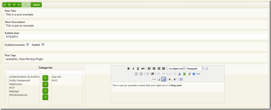
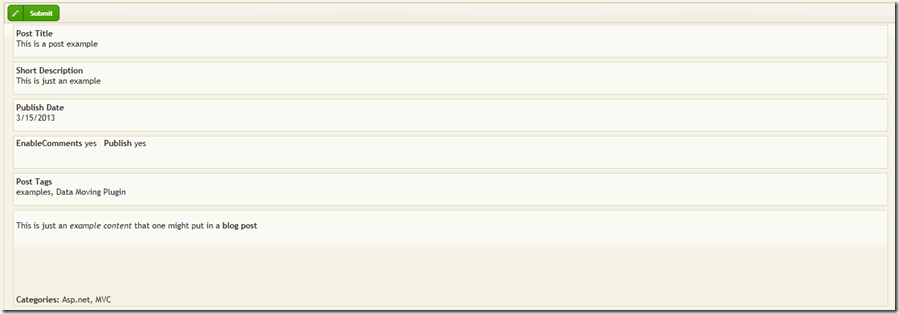
The Tags column uses standard column templates, while the Content column specifies both edit and detail custom templates. The edit template contains a DualSelect that enables the user to select categories from a pre-existing list and a TextArea that is enhanced with the tinyMce text editor. The detail template contains a div with an html knockout binding to display the html produced by tinyMce, and a text knockout binding that displays all categories selected by the user.
The resulting Edit View is:

While the resulting display view is:

That’ all for now!
Stay tuned and give a look also to all other Data Moving Plugin introductory tutorials and videos
Francesco
Tags: MVC Controls, MVC Helpers, mvc, MVC Controls Toolkit, Data Moving